Simple JavaScript Theme Toggle
Wednesday, August 7, 2019
A simple way to add a theme toggle to your website using HTML, CSS, and basic JavaScript.

Introducing ezToggle
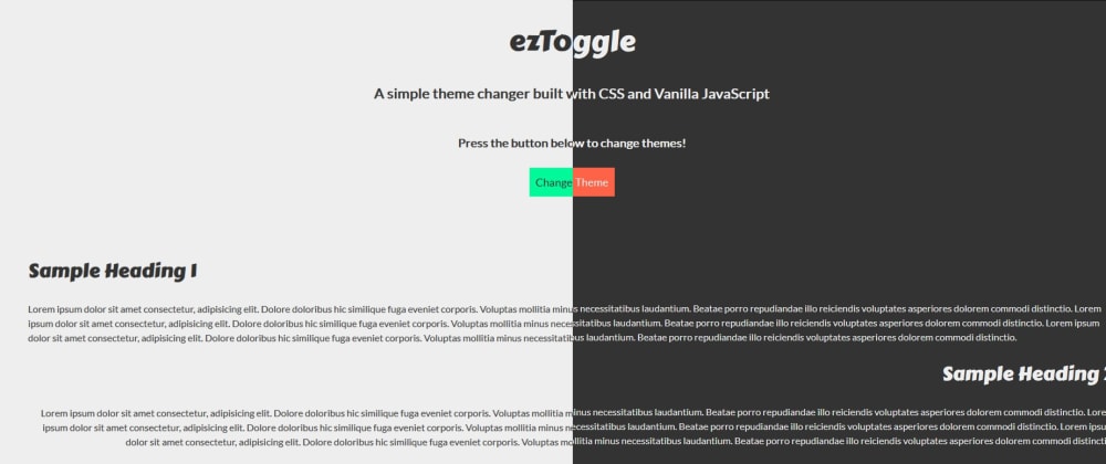
This past weekend I created ezToggle (has since been archived and no longer maintained/updated) - a simple way to add a theme toggle to your website using HTML, CSS, and basic JavaScript.
This is my first JavaScript success story but, for those of you that are looking for a simple way to add a light/dark theme toggle to your site this might be it!
Best of all, it includes minimal JavaScript so anyone should be able to use it.
var body = document.querySelector('body');
var bodyClass = body.classList;
var themeToggle = document.querySelector('#theme-toggle');
var footer = document.querySelector('.footer');
var light = document.querySelector('.light');
var dark = document.querySelector('.dark');

themeToggle.addEventListener('click', () => {
    body.classList.toggle("light");
    body.classList.toggle("dark");
    themeToggle.classList.toggle("btn-light");
    themeToggle.classList.toggle("btn-dark");
    footer.classList.toggle("footer-light");
    footer.classList.toggle("footer-dark");
});
Now then, if your footer doesn't change colors that's 3 lines you could remove from this - the real secret is in using CSS Variables. Let's go over how you can implement this in your website!
Getting Started
To begin you'll need the CSS & JS files which you can find in the GitHub Repo.
I have recently discovered CSS Variables and absolutely love them and knew they'd be perfect for this project - and every project moving forward.
If you don't know, a CSS Variable is a CSS Property that you can define once and call throughout the document. This makes it great for things such as colors, transitions, margin/padding, and much more! Whatever you repeat throughout your CSS can be turned into a variable.
This is particularly great for themes because you can change the colors in the variable you set once and they will be changed throughout the entire document.
/*--------------------Reusable Variables--------------------*/
:root {
    /*--------------------Light Theme Variables (Default)--------------------*/
    --light-theme-background-color: #eee;
    --light-theme-darker-background-color: #ccc;
    --light-theme-text-color: #333;
    --light-theme-link-color: #ff6347;
    --light-theme-link-hover-color: #fa2600;
}
More On CSS Variables
If you look at the code below you can see that I define the light theme in just 3 properties.
.light {
    background: var(--light-theme-background-color);
    color: var(--light-theme-text-color);
    transition: var(--theme-change-timing);
}
Anywhere in the document I put var(--light-theme-text-color); it will take on the same color which we defined as #fff; in --light-theme-text-color: #333; Why did I define the themes in 2 classes .light and .dark? Because I can simply add said class to the body tag and BAM you've got your theme change.
Setup
HTML
First off, we need to apply a class of light to our body tag:
<body class="light">This sets the default theme to whatever is defined in our .light class. If you want the default theme to be dark, just change it to <body class="dark">.
CSS
There are a few steps involved in setting up the CSS. The first step is defining our CSS Variables in the :root psudo-class. The reason for this is so that you don't have to repeat the variable in different elements on the page. When you declare them in :root every element has access to them.
/*--------------------Reusable Variables--------------------*/
:root {
    /*--------------------Light Theme Variables (Default)--------------------*/
    --light-theme-background-color: #eee;
    --light-theme-darker-background-color: #ccc;
    --light-theme-text-color: #333;
    --light-theme-link-color: #ff6347;
    --light-theme-link-hover-color: #fa2600;

    /*--------------------Dark Theme Variables--------------------*/
    --dark-theme-background-color: #333;
    --dark-theme-darker-background-color: #111;
    --dark-theme-text-color: #eee;
    --dark-theme-link-color: #00fa9a;
    --dark-theme-link-hover-color: #00955b;

    /*--------------------Other Variables--------------------*/
    --link-hover-timing: all 0.25s ease-in-out;
    --theme-change-timing: all 1s ease-in-out;
}
Next I created some classes for each theme. This included a general .light and .dark theme for the body, as well as a btn-light and .btn-dark, and .footer-light and .footer-dark.
/*--------------------Light Theme Styles (Default)--------------------*/
.light {
    background: var(--light-theme-background-color);
    color: var(--light-theme-text-color);
    transition: var(--theme-change-timing);
}

.light a {
    color: var(--light-theme-link-color);
}

.light a:hover {
    color: var(--light-theme-link-hover-color);
}

.footer-light {
    background: var(--light-theme-darker-background-color);
}
Just remember to apply any classes you create to the appropriate elements in your HTML file so they all get themed appropriately.
JavaScript
Firstly, we need to define our variables. You should do this at the top of the file so if you call these variables outside this theme toggle function they are available to them.
var body = document.querySelector('body');
var bodyClass = body.classList;
var themeToggle = document.querySelector('#theme-toggle');
var footer = document.querySelector('.footer');
var light = document.querySelector('.light');
var dark = document.querySelector('.dark');
If you choose not to style the footer you can just remove it, however, for ezToggle I made the footer darker than the rest of the page so I had to define it here so it can be called upon in the following function:
themeToggle.addEventListener('click', () => {
    body.classList.toggle("light");
    body.classList.toggle("dark");
    themeToggle.classList.toggle("btn-light");
    themeToggle.classList.toggle("btn-dark");
    footer.classList.toggle("footer-light");
    footer.classList.toggle("footer-dark");
});
The function listens for a click on the themeToggle button - the one that reads "Change Theme" on the website.

Upon the button being clicked it first identifies the classes of the element it is attached to. Followed by .toggle it then toggles (surprise) the specified class onto said element. It toggles between the light and dark classes.

Wrapping Up
Here's a summary of the steps needed to apply ezToggle to your website:
Apply light or dark class to
<body>in your HTMLDefine your CSS variables in the
:rootpseudo-class. Make sure you change, add, or remove any colors you need for your theme.Create, add, or remove any necessary classes for your themes and any items getting themed.
Define JavaScript Variables
Enjoy your theme toggle!
I hope you enjoyed and understood my first technical blog. I'm looking forward to doing more of these in the future.
If you have any questions or issues using ezToggle please don't hesitate to reach out to me via Twitter or my website.